~~Updated~~
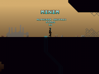
redesigned character, and put more effort into his animation, and even named him as you can clearly see
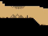
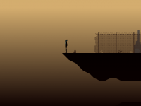
been overhauling the tileset, was thinking coloured props in foreground and silhouettes behind, (zdepth relative to the player, what he passes behind and in front of, silhouettes behind him and coloured in front of him)
what's you're opinion on the coloured bits? Should i go back to strictly silhouettes?
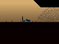
The blue thing on the floor is basically a checkpoint, i've mainly been doing new graphics and modifications, and making the bitmap font.
The game is a exploration platformer, the gameplay will consist of exploring of course, and progress into areas will be hindered by puzzles/obstacles overcome with new abilities, there will be some backtracking. There will be themed areas etc etc
what do you guys/gals think?


