Game Editor future
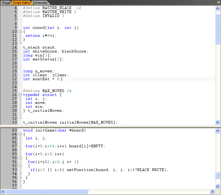
makslane wrote:Here's a screenshot of the new Script Editor:
Do you have any plans on making a wizard for non-programmers?
Also, if you need help with graphical displays, I can help you on that
I'm an artist and designer
- Janet Merai
- Posts: 51
- Joined: Wed May 11, 2005 5:30 am
- Score: 1

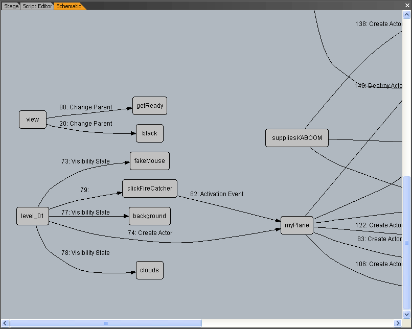
makslane wrote:There is a new panel called "Schematic". With Schematic you can see the actors relationships, like the actions between two actors.
Here a screenshot after execution of 1945 demo:
You can see the complete graph here:
http://game-editor.com/images/screensho ... rface4.gif
I think what you did there is awesome Mak
Though for users like me who prefer to be extremly organized and neat, will there be a nested one too?
Example:
-------------------------
-Character A:
||
||
| - Shoot bullet
| | - Make bullet disappear
|
Character B:
|
- Recieve money
-------------------------
This would make game creation a snap to me, do you plan on doing that as well?
- Janet Merai
- Posts: 51
- Joined: Wed May 11, 2005 5:30 am
- Score: 1

That is awesome Mak 
Just where do you get your drive to improve this program so much?
I know other programmers fret at improving their programs based on user expression
Just where do you get your drive to improve this program so much?
I know other programmers fret at improving their programs based on user expression
- Janet Merai
- Posts: 51
- Joined: Wed May 11, 2005 5:30 am
- Score: 1

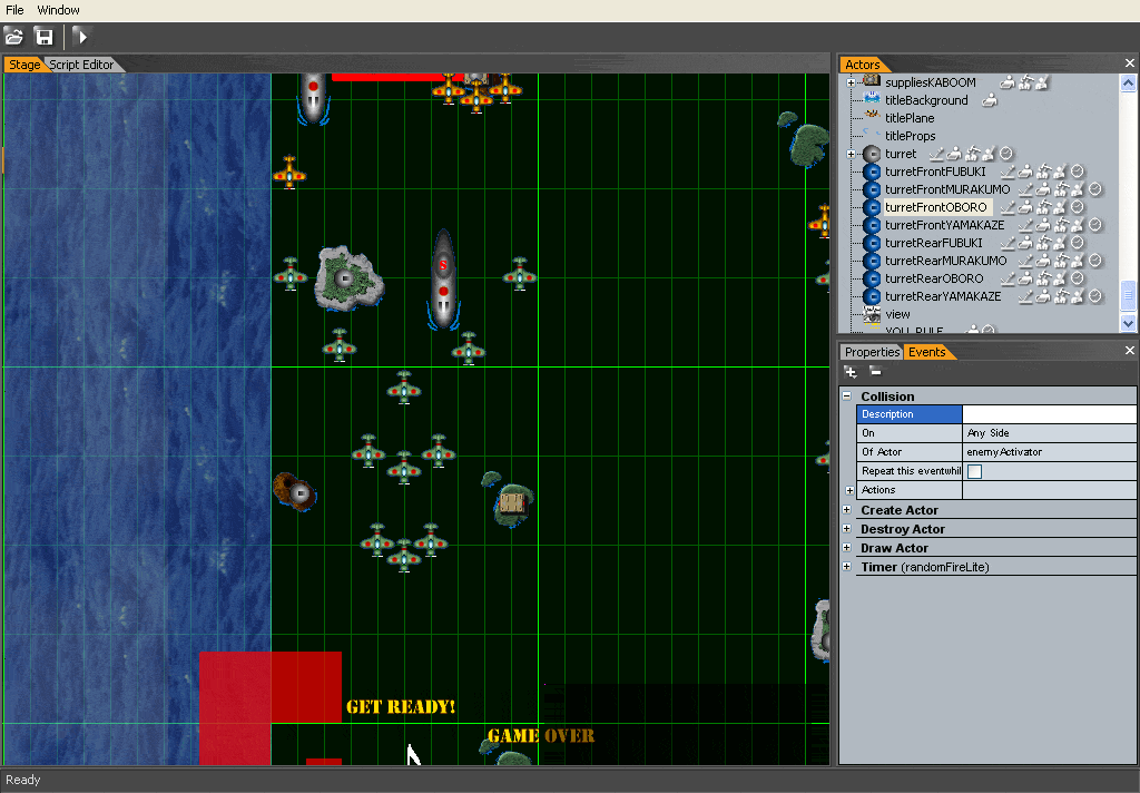
makslane wrote:Some thing like this:
Hey Mak, I have yet another question
With regards to the first and second image, when you select a named actor does a caption of the name or preferred name show up where you may want to specify where names go on it?
Like, say you alter the captions alignment and stuff, example:
Fist 1 Fist 2
[IMAGE] [IMAGE] [IMAGE] Fist 3 [IMAGE] (etc.)
Fist 4
Or an arrow animated or not:
-> [IMAGE] ->(pointing down-right) [IMAGE]
Or a highlight behind the image animated or not:
< (IMAGE) >
Would you be able to do that with an available on/off feature?
And the part where the images are given attention to with those said features, it would be awesome if they were both animated in the actual editor part (where all the actors and regions are) and the nested/schematic/etc. views are
- Janet Merai
- Posts: 51
- Joined: Wed May 11, 2005 5:30 am
- Score: 1

I will explain in better detail for you 
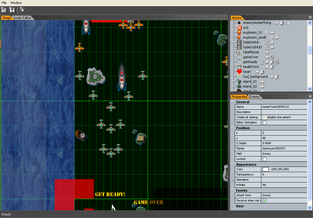
Okay, like on the first two images you posted look at the "Actors" tab highlighted in "orange" on the right side.
There is a nested view of all actors.
Say if you selected an actor in the "Actor" view/tab, then on the left side, where all those planes plus the "GET READY!" and "GAME OVER" titles are inside the "Stage" tab/view, what you select in the "Actors" tab highlights or captions the same "Actor" object(s) in the "Stage" view so you see exactly where the actor is
Does that make anything clearer to you?
- Janet Merai
- Posts: 51
- Joined: Wed May 11, 2005 5:30 am
- Score: 1

I'm glad you like it Mak 
I would be great if you did it for the "Stage" view too in reverse or just click an actor in the "Stage" view and it highlights on both or one area(s)
I would be great if you did it for the "Stage" view too in reverse or just click an actor in the "Stage" view and it highlights on both or one area(s)
- Janet Merai
- Posts: 51
- Joined: Wed May 11, 2005 5:30 am
- Score: 1

Maybe you could make a teaser video of the new interface, or if you can, release a beta version! 
Stay sweet
-

Joshua Worth - Posts: 515
- Joined: Tue Jul 19, 2005 12:00 am
- Location: Stralia
- Score: 5

Who is online
Users browsing this forum: No registered users and 1 guest


