[Forum Project #1] Steam Run Design Document

Subforum dedicated to discussing group projects.

Re: [Forum Project #1] Steam Run Design Document

Postby skydereign » Mon Mar 11, 2013 1:41 am

sonicforvergame wrote:Okay so i finished the electric shot gun and here is the image for it

resistance.PNG


now if you think there is wrong with it please tell me so i can change it

Some possible improvements.
  • Most importantly... use a unified style. Currently everything looks like different sources copied into a single picture. In fact, don't use elements you find off the internet. Actually drawing it yourself is an easy way to it looking somewhat uniform (and doing your own art is what makes you better at it).
  • Define the outlines of the gun more.
  • Unify depth, the handle lacks any 3d look, while the rest of blue part has a lot more (goes with the first point).
  • Fix the wood handle's actual position relative to the pieces of the gun. Currently it is behind both the blue things, making the gun off balance.
  • Fix the depth of the blue things, one it looks like you flip which one is closer to the camera, and it makes it look confusing (because you cropped the closer one).
  • Improve the color scheme, straight blue makes it look too futuristic. The idea of that gun was it create a magnetic field to launch projectiles, not that it is pure energy.
  • Add a switch to the battery, currently it can't be turned on.
  • Those winding things around the blue (which the blue was supposed to be metal) are wires, which are used to make the magnetic properties of the gun.
I think that is enough to get you going.
User avatar
skydereign
 
Posts: 3510
Joined: Mon Jul 28, 2008 8:29 am
Score: 589 Give a positive score

Re: [Forum Project #1] Steam Run Design Document

Postby kickstart » Mon Mar 11, 2013 2:04 am

Those winding things around the blue (which the blue was supposed to be metal) are wires, which are used to make the magnetic properties of the gun.

I swear that the gun was going to be made of the resistor itself, like the 3D image. Instead of using ripped textures and shaping them together can't we just use the resistor? Or were we just basing the electric gun off of the resistor and not using the image itself?
kickstart
 
Posts: 97
Joined: Tue Jan 29, 2013 8:42 pm
Score: 6 Give a positive score

Re: [Forum Project #1] Steam Run Design Document

Postby GEuser » Mon Mar 11, 2013 3:58 am

@ Jagmaster
...I did some very sloppy sketches of buildings. They're sort of above-surface buildings. Sort of a factory theme without much other direction...

The building on the right looks like a medieval astronomer's observatory. It has a very medieval look, was that deliberate?
http://en.wikipedia.org/wiki/Medieval_architecture
I like the feel of it. It kind of conjures up an expectation of a watermill just around the corner. lol

@ sonicforvergame

...Okay so i finished the electric shot gun and here is the image for it...now if you think there is wrong with it please tell me so i can change it...

More or less what Sky said really, keep at it and work on developing your own style.


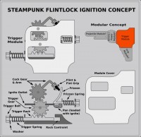
STEAMPUNK FLINT-LOCK MECHANISM CONCEPT


Re-adapted from this:
http://en.wikipedia.org/wiki/File:Flint ... mation.gif
Made-up some new terms for the various parts. I was thinking of modulising guns/weapons for my concept art. You assemble different modules to create new gun/weapon styles.

CONCEPT ART
I think it looks cool to have little windows on the module cover so that you can have a peep at the underlaying mechanism (what you think?)

Flintlock_IgnMod001a.jpg


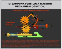
TRIGGER CYCLE

Everything appearrs to be okay. Can't detect any major flaws, have a look:-
Flintlock_IgnCyc001a.jpg


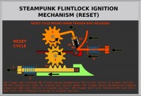
RESET CYCLE
The only issue I have with the Reset Cycle is that when the Frizzen returns to reset position it rre-engaging with flint creating a secondary spark on the way up. I'll need to include some kind of delay mechanism for the Frizzle or the Flint on the return to avoid this. Do you guys think I could get way with it as is? Here's the Reset Cycle:
Flintlock_IgnCyc001b.jpg


WEAPON SMITHING

Another idea, the hero could gradually build up each module from the rebel camps weaponsmith and there would be a progress bar showing completeness so that getting each bit made wouldn't be immediate (may be a contextual description of progress: "At 60% now assembling Flint Grip"). Hero would give parts and return to check-up if unit built (or could be continuously displayed on game status bar if any parts pending). Imho, this would add a level of anticipation and make the hero-player engage more with the game world.

Have some more illustrations to demonstrate weapon smithingm stll preparing so coming soon...
GEuser
 
Posts: 204
Joined: Thu Jan 05, 2012 3:08 pm
Score: 19 Give a positive score

Re: [Forum Project #1] Steam Run Design Document

Postby GEuser » Mon Mar 11, 2013 4:17 am

JetpackGrizzly wrote:
Those winding things around the blue (which the blue was supposed to be metal) are wires, which are used to make the magnetic properties of the gun.

I swear that the gun was going to be made of the resistor itself, like the 3D image. Instead of using ripped textures and shaping them together can't we just use the resistor? Or were we just basing the electric gun off of the resistor and not using the image itself?


Nah, if you want to propel stuff with a magnetism you'd use a coil (also Solenoid). There's something called the Flemings Right Hand Rule that tells you in which directon the force / motion is depending on the direction of the current and magnetism. Look here:

http://www.one-school.net/Malaysia/Univ ... t-Hand.png

and this is related too:

http://www.electronics-tutorials.ws/ele ... /mag10.gif

Planning this stuff for more concept art later on to explain it better (working on other stuff right now).
GEuser
 
Posts: 204
Joined: Thu Jan 05, 2012 3:08 pm
Score: 19 Give a positive score

Re: [Forum Project #1] Steam Run Design Document

Postby sonicforvergame » Mon Mar 11, 2013 4:42 pm

skydereign wrote:
sonicforvergame wrote:Okay so i finished the electric shot gun and here is the image for it

resistance.PNG


now if you think there is wrong with it please tell me so i can change it

Some possible improvements.
  • Most importantly... use a unified style. Currently everything looks like different sources copied into a single picture. In fact, don't use elements you find off the internet. Actually drawing it yourself is an easy way to it looking somewhat uniform (and doing your own art is what makes you better at it).
  • Define the outlines of the gun more.
  • Unify depth, the handle lacks any 3d look, while the rest of blue part has a lot more (goes with the first point).
  • Fix the wood handle's actual position relative to the pieces of the gun. Currently it is behind both the blue things, making the gun off balance.
  • Fix the depth of the blue things, one it looks like you flip which one is closer to the camera, and it makes it look confusing (because you cropped the closer one).
  • Improve the color scheme, straight blue makes it look too futuristic. The idea of that gun was it create a magnetic field to launch projectiles, not that it is pure energy.
  • Add a switch to the battery, currently it can't be turned on.
  • Those winding things around the blue (which the blue was supposed to be metal) are wires, which are used to make the magnetic properties of the gun.
I think that is enough to get you going.

Okay........
first: i made all of the gun (all of it )i didn't took anything From the internet i just used GEuser's 3d resistor wich he accepted to give me
Second:i didn't crop any resistor ,they are both full BUT there was a unnecessary metal at the end that was cropped(not the resistor itself)
Third:You got it right the Resistor itself should be Metal color but The wires should be blue because they are the one that get energie to make the magnetic field
Fourth:i didn't want to use the resistor As a resistor i thought that it look very close to the drawing you made so i used the "resistor"because it's similar to the drawing
Fifth:i don't know why you should have a switch to the battery because it's (i think)not important i't just another animation in plus without forgetting that you(skydereign)will have to find a way to switch the the gun on so it will be able to make a magnetic field and without forgetting that if the gun is off you can't make a magnetc field .Now i know that you can make this in script and i have my idea too But i'ts just more Script to do and i think not really necessary (if i can say that) but anyway i will be able to do a switch if we need to add one
Last edited by sonicforvergame on Mon Mar 11, 2013 8:10 pm, edited 1 time in total.
Kaizoku ni ore wa naru
User avatar
sonicforvergame
 
Posts: 422
Joined: Sat Sep 01, 2012 2:17 pm
Score: 10 Give a positive score

Re: [Forum Project #1] Steam Run Design Document

Postby knucklecrunchgames » Mon Mar 11, 2013 7:47 pm

Hope you do well. Have you made progress yet
User avatar
knucklecrunchgames
 
Posts: 1071
Joined: Wed Nov 21, 2012 8:01 pm
Location: In gameEditor.exe
Score: 17 Give a positive score

Re: [Forum Project #1] Steam Run Design Document

Postby skydereign » Mon Mar 11, 2013 7:56 pm

First off, please don't respond within a quote. That makes it look like someone else said it. Now, pretty much all of my suggestions still hold. Even if you didn't copy anything from the internet, it looks like you did. I can see five different styles in that gun. You should aim for one style.
User avatar
skydereign
 
Posts: 3510
Joined: Mon Jul 28, 2008 8:29 am
Score: 589 Give a positive score

Re: [Forum Project #1] Steam Run Design Document

Postby knucklecrunchgames » Mon Mar 11, 2013 8:00 pm

skydereign wrote:First off, please don't respond within a quote. That makes it look like someone else said it. Now, pretty much all of my suggestions still hold. Even if you didn't copy anything from the internet, it looks like you did. I can see five different styles in that gun. You should aim for one style.


Are you talking to me ?
User avatar
knucklecrunchgames
 
Posts: 1071
Joined: Wed Nov 21, 2012 8:01 pm
Location: In gameEditor.exe
Score: 17 Give a positive score

Re: [Forum Project #1] Steam Run Design Document

Postby skydereign » Mon Mar 11, 2013 8:10 pm

knucklecrunchgames wrote:Are you talking to me ?

No, none of that applies to what you did or said. That was in reply to sonicforevergame.
User avatar
skydereign
 
Posts: 3510
Joined: Mon Jul 28, 2008 8:29 am
Score: 589 Give a positive score

Re: [Forum Project #1] Steam Run Design Document

Postby sonicforvergame » Mon Mar 11, 2013 8:28 pm

@skydereign

I fixed the error in the quote
Can you tell me what 5 element you think have been tooken from the internet ?(i am curious)
Kaizoku ni ore wa naru
User avatar
sonicforvergame
 
Posts: 422
Joined: Sat Sep 01, 2012 2:17 pm
Score: 10 Give a positive score

Re: [Forum Project #1] Steam Run Design Document

Postby knucklecrunchgames » Mon Mar 11, 2013 8:53 pm

skydereign wrote:
knucklecrunchgames wrote:Are you talking to me ?

No, none of that applies to what you did or said. That was in reply to sonicforevergame.


Oh Ok
User avatar
knucklecrunchgames
 
Posts: 1071
Joined: Wed Nov 21, 2012 8:01 pm
Location: In gameEditor.exe
Score: 17 Give a positive score

Re: [Forum Project #1] Steam Run Design Document

Postby kickstart » Tue Mar 12, 2013 12:07 am

sonicforvergame wrote:@skydereign

I fixed the error in the quote
Can you tell me what 5 element you think have been tooken from the internet ?(i am curious)

It's not a matter of that, if its originally, like dereign said here:

skydereign wrote:First off, please don't respond within a quote. That makes it look like someone else said it. Now, pretty much all of my suggestions still hold. Even if you didn't copy anything from the internet, it looks like you did. I can see five different styles in that gun. You should aim for one style.


There should be one style within the gun, and for example, the wood, and the blue, are totally different and don't work as together as one image.
kickstart
 
Posts: 97
Joined: Tue Jan 29, 2013 8:42 pm
Score: 6 Give a positive score

Re: [Forum Project #1] Steam Run Design Document

Postby happyjustbecause » Tue Mar 12, 2013 3:06 am

I was kind of bored today and I thought of making some kind of title looking thing for Steam Run. Maybe we could use this image as the one for the forum topic image. I'm not really a logo designer, I just was playing around with a program I have, hopefully this will at least inspire someone to make a better logo.

Image

Image

Image
Attachments
Steam Run5.png
For small creatures such as we the vastness is bearable only through love.
-Carl Sagan

Night Knight Development Thread
User avatar
happyjustbecause
 
Posts: 267
Joined: Tue Jul 26, 2011 3:10 pm
Location: Frazier Park, Ca
Score: 15 Give a positive score

Re: [Forum Project #1] Steam Run Design Document

Postby GEuser » Tue Mar 12, 2013 11:43 pm

@ happyjustbecause

That logo looks really neat. I could imagine something similiar being used for the game front screen (for selecting starting options) or the visual side of a button menu system. Do some more, curious to see what else you come up with.
GEuser
 
Posts: 204
Joined: Thu Jan 05, 2012 3:08 pm
Score: 19 Give a positive score

Re: [Forum Project #1] Steam Run Design Document

Postby Jagmaster » Wed Mar 13, 2013 3:36 am

That's a pretty cool logo hjb. The typography looks neat!
Question - how'd my silhouette get on the topic's thumbnail? I'ts not even the first file uploaded! :shock: Must be a glitch.

GEuser wrote:The building on the right looks like a medieval astronomer's observatory. It has a very medieval look, was that deliberate?
I like the feel of it. It kind of conjures up an expectation of a watermill just around the corner. lol


I guess you could say it was deliberate on a subconscious level. (I love contradictions, sorry)
I'm glad you liked the feel of it. I was aiming for a historical look. I didn't research much prior, which was rather silly. I guess that explains why it looks rather medieval. :P
And the telescopes, I'm trying to evoke "Big Brother is watching you" thematically through architecture. Perhaps that effect can be achieved with lots of windows and propaganda posters. It's important that have a setting that causes a certain level of paranoia.

Now, on the topic of renders:

I've finally come up with a cell shaded render (with some post processing) that at least I'm happy with.
I used a black and white texture to distort the shader a bit. After rendering I brushed on some additional grime and adjusted the color a bit.
Image
Image
I'm not sure what's preferable, with or without outlines.
Here's the gimp file that contains the original render along with the grime and color adjustment layers. https://dl.dropbox.com/u/38920518/Web%20storage/Steam%20Run/FinalComposite.xcf
User avatar
Jagmaster
 
Posts: 875
Joined: Sun May 08, 2011 4:14 pm
Location: Not where you think.
Score: 82 Give a positive score

PreviousNext

Return to Forum Projects

Who is online

Users browsing this forum: No registered users and 1 guest

cron