 by skydereign » Mon Jul 06, 2009 12:42 pm
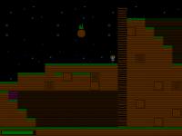
Okay, I went through it a couple times, and this is what I have come up with. When you die, the screen moves, not really sure where, just left or right, probably to the center of the current room, though this is not always the case. I assume this is because you haven't implemented an actual death sequence. Now this is not the case when you fall off the edge. When you do so, you can still move left and right, also allowing us to see how you did movement. I think you use xvelocity, with collision with ground acting as the slow down. You increase the velocity to a limit, and so on. You can move around then, unless you reach the very end of the screen, to the right, and it triggers the same death event, moving the screen to left or center. The sign text that shows, Dark Path, when you are touching the sign is still hard to read, and it would be easier on the eyes if you made a box for your normal text display, especially if the majority of the game is done at the night stages. Doesn't have to be fully opaque but something to lessen the contrast. Not sure if you can fix this one, but when you press down, only sometimes, you move a pixel back, which makes it look jumpy. It's not that important, but it is there, I think it has to do with the standing vs running animations. I guess you covered it, but I will mention it for consistency, the view skips along with the player whilst sliding when the view is moving. Also, not that anyone will do this, but you can get Ronnie to say ouch before he gets hit, if you deem it worthy of fixing, an easy fix would be to set a counter to regulate the timing for at least the opening scene. The press x for the switch, is there not supposed to be a space, pressx, or press x? You have up down moonwalking on the ladder, but nowhere else. I am assuming that when you get the cloneing ability, spelled cloning, you can't return to go up to the zombie, because the door never unlocks... Not sure what you are going to do with the cloning. The down stop ability does not work if you are on the corner of a tile, because you end up slipping off, in my case into the lava. Also, it is a bit weird how the enemies freeze when they leave the view. So when you get back, they are in the same position, but maybe I am looking too hard. The background sky is a tad on the repetitive side, in my opinion, though it does fit the style itself pretty well. That is all I found after a couple of runs, hope that helps. I like the birds, very subtle, though I may turn down their frequency just a tad, but things like that can make a game that much more remarkable. Also, the foreground to background change is pretty cool. It saddens me that you can't attack yet, but I can wait. Overall good job, I don't know about sound, as gameEditor does not agree with Linux, or maybe pulse audio doesn't agree with exes...

