Page 1 of 1

Which one is the better ???

PostPosted: Fri Feb 26, 2010 2:38 pm
by Bee-Ant
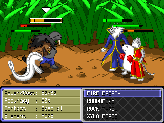
Which one is better between this 2 battle mode ???
WB3-NewBattleScene.png

VS
WBQ-TeamBattle3.png

Re: Which one is the better ???

PostPosted: Sat Feb 27, 2010 3:23 am
by Hblade
The first one :D

Re: Which one is the better ???

PostPosted: Sat Feb 27, 2010 4:45 am
by NUTINC
Yeah, I agree. I like the first one better. I've never liked that whole over-the-shoulder view Pokemon has.

Re: Which one is the better ???

PostPosted: Sat Feb 27, 2010 8:31 am
by MrJolteon
yes yes, but the characters mean nothing on these two samples. He probably just picked some characters.
I choose number 1 too, i liked it when you had it in WB2, but then you changed it :(

Re: Which one is the better ???

PostPosted: Sat Feb 27, 2010 10:40 am
by Bee-Ant
Yeah, i was selfish...as if i made game for my self. I forgot that i need some interacts with you guys.

Well, i just asked about the view mode, how they look. There wont be any animation when attacking just like the very first version. Sorry, this is due to too much of characters i have to handle.

Thanks for all :D

Okay, what about the character size ?
Image
VS

Re: Which one is the better ???

PostPosted: Sat Feb 27, 2010 12:12 pm
by MrJolteon
Second one.

Re: Which one is the better ???

PostPosted: Sat Feb 27, 2010 12:38 pm
by Bee-Ant
Well, then...
it's settled...
Thanks

Re: Which one is the better ???

PostPosted: Sun Feb 28, 2010 4:05 am
by Hblade
:D

Re: Which one is the better ???

PostPosted: Tue Mar 23, 2010 2:47 am
by Scorpion50o1
i like the health on second one but i like the view on 1st one :)

Re: Which one is the better ???

PostPosted: Tue Mar 23, 2010 3:28 pm
by Bee-Ant
Scorpion50o1 wrote:i like the health on second one but i like the view on 1st one :)

Okay, it's easy to integrate :D

Re: Which one is the better ???

PostPosted: Thu Apr 29, 2010 1:07 pm
by uan
Scorpion50o1 wrote:i like the health on second one but i like the view on 1st one :)

+1