Page 4 of 7
Re: GE's Presentation

Posted:
Sat May 07, 2011 5:00 amby OmniArts
nice idea, i can see that could work.
seeing were throwing it all on the table.. heres a concept i was working on earlier featuring "
the game editor"

Re: GE's Presentation
Posted:
Sat May 07, 2011 6:25 amby MrJolteon
again wrote:Ok I think omni-arts or skyderign can do this better but here it is. Ever letter of game editor should look like a video game charactor!! That will blow potential users minds!! Its an awesome and original idea , so someone else can pull it off better than me though here the start.

Lol?
The M looks like the World Trade Center with a bridge in between
Edit:
That A looks familiar...
Hmm...OmniArts wrote:it still needs alot of work.. but here a concept.
Looking forward to taking one of these designs into 3d!
Pretty good
Re: GE's Presentation
Posted:
Tue May 10, 2011 2:13 amby Chai
Hi all, Nice logo after all.
We should keep the logo more simple and less element on it. that will make people remember it easier.
[just in my opinion.

]

Nice work,
Cheer
Re: GE's Presentation
Posted:
Tue May 10, 2011 5:01 amby schnellboot
Chai wrote:
this looks like Gj xD
Re: GE's Presentation
Posted:
Tue May 10, 2011 11:13 amby MrJolteon
schnellboot wrote:Chai wrote:
this looks like Gj xD
Lol yeah xD
Re: GE's Presentation
Posted:
Thu May 12, 2011 5:03 amby OmniArts
nice idea chai, i agree. ill see what i can come up with based on your design
Re: GE's Presentation
Posted:
Thu May 12, 2011 5:40 amby again
Time for less laughing and more art. The 2 guys joking around , lets see your art , so maybe I can have a laugh Hahaha.
Re: GE's Presentation
Posted:
Thu May 12, 2011 5:59 amby schnellboot
no joke at all
Re: GE's Presentation
Posted:
Mon May 16, 2011 7:47 amby rykein
it really does look like Gj. i can kind of see a backwards e in it. anyway is this goin anywhere? i know omni and sky are prolly busy with apalia but i just say the mac app for ge thanks to freddy and itd be nice to have a proper presentation for that. nice software but kinda lackin in the presentation department.
Re: GE's Presentation
Posted:
Tue May 17, 2011 10:07 pmby OmniArts
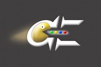
Just a few more ideas I've been working on.
the pacman has been somewhat fixed.. still looks kinda odd tho.
and the space invader.. i wouldnt mind doing a full color version of that

Re: GE's Presentation
Posted:
Thu May 19, 2011 9:21 amby rykein
not sure if mak even follows this. he should but there are many small things he should do to help ge a lot. maybe if enough people want it he'll let us change it. that spaceship looks familiar.
Re: GE's Presentation
Posted:
Thu May 19, 2011 7:57 pmby makslane
This last logo looks nice, but I think there is a problem: Call Game Editor here as "GE" is ok, but use this term officially in the logo is not due to trade mark problems.
Re: GE's Presentation
Posted:
Thu May 19, 2011 9:45 pmby skydereign
I don't think you can trademark two letters. I'm not too well versed in trademark laws, but the big GE trademarked their logo, not the letters. Anyway, that last logo isn't exactly what we are going for. The copyright problems seem much more real than any possible trademark problems with ge, and we mentioned before we are trying to move away from that pacman.
Re: GE's Presentation
Posted:
Sat May 21, 2011 8:55 pmby SuperSonic
OmniArts wrote:
I like the Game controller and the "get_on_board_now();" makes me laugh. But that dude with the creepy chin just freaks me out XD
Re: GE's Presentation
Posted:
Sun May 22, 2011 3:43 pmby OmniArts
lol yea he does look strange..
below i have some new designs ive been working on for a while.
New GE Icon New GE Splash Screen
 Website Design
LINK:
http://apaliahd.com/test/ge_site_new.jpg